Whether you love the idea or hate it, fall is on its way. And the best way to embrace the season is to rethink the decor in your home.
While light whites and airy linens are just what we want throughout the summer months, fall beckons something a little more warming. The most impactful way to update your room scheme for fall is with color.
From single and striking feature walls, to color drenching your room for maximum impact, paint ideas can completely transform the look and feel of your space.
And as we naturally spend more time indoors as the temperature drops outdoors, it’s all the more important that our homes give us what we need. And in fall, what we need is cozy, cocooning, and colorful.
Check out our edit of the best 6 paint colors for the season, and prepare to hunker down as the nights draw in.
1. Earthy browns

(Image credit: Benjamin Moore)
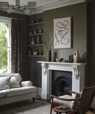
Decorating with brown has been hugely popular in the interior design sphere throughout the whole of 2024, largely due to its grounding and earthy qualities. This fall, brown is really coming into its own. With its obvious link to crispy fallen leaves, this warming hue is set to take the spotlight.
A perennial favorite, easy-to-use brown paint is Mortar by Benjamin Moore, which is used in the living room above. It’s more of a taupe-come-brown with earthy green undertones so you get the coziness of brown without the potential drabness.
Brown shades are surprisingly easy to use within a room scheme. ‘The versatility of brown shades means they fit with most color palettes, but particularly neutral ones,’ says Bailey Oates, color expert at Earthborn. ‘Pair the color with earthy decor to infuse the home with a nature-inspired tranquillity.’
‘The timeless color brings a warming appeal that grounds the space and adds a sense of calm and sophistication. Darker brown tones exude feelings of relaxation and can create a cozy, cocooning effect, whereas their lighter counterparts open up a space, creating a welcoming atmosphere,’ Bailey adds.
‘This season, I think we will be seeing some great chocolate browns that pair well with baby blues, and rich caramels, which pair well with blush tones,’ says designer Grey Joyner.
2. Jewel-toned blues
(Image credit: Fenwick & Tilbrook)
We’ve seen a range of blue hues trending this year, but as fall arrives, darker shades like indigo, midnight blue, and inky hues are set to shine.
‘Blue hues, such as Major Tom, will dominate so expect to see various shades drenched across all surfaces from walls and ceilings to woodwork and architectural details,’ says Anna Hill, brand director and color consultant at Fenwick and Tilbrook.
‘Deep blue shades like navy, indigo, and midnight blue are the top choices for the upcoming autumn/winter season,’ says Anna. ‘These colors are popular for their ability to create a sophisticated yet cozy atmosphere. The richness of the blues adds depth and elegance to any space, whilst the versatility allows these shades to be easily paired with a variety of colors.’
3. Rich golds
(Image credit: Benjamin Moore)
While decorating with yellow is often associated with spring and summer, a deeper, warmer, richer shade can bring warmth and coziness in the chillier months.
‘We’re continuing to see a strong desire to incorporate the soothing colors of the natural world into interiors, evoking a sense of calmness,’ says Bailey.
‘This doesn’t mean just using greys, whites and creams. Instead, we are seeing the introduction of colors with subtle yellow undertones that add warmth to the space and offer total versatility that brings longevity and timeless appeal to all spaces,’ says Bailey.
Summerdale Gold, by Benjamin Moore, is a grounded honey gold with hushed green undertones. Alongside natural textures and hints of black, the scheme is sophisticated, warm, and contemporary.
‘We’d advise color-drenching these warming hues, taking them across your walls, trim and even ceiling to create a cosy cocooning effect,’ says James Greenwood, interior and color expert at Graham & Brown.
4. Deep orangey-reds
(Image credit: Farrow & Ball)
The unexpected red trend has been big news for this year, so take an organic, earthy spin on the shade for a cozy fall focal point.
‘Red is very much of the moment,’ says Patrick O’Donnell, brand ambassador at Farrow & Ball. ‘Whether used as a splash of color on a kitchen island or taken across all the cabinets, there is an elegant restraint with this look, especially if you err towards an earthy, brick red.’
Terre D’Egypte by Farrow & Ball is a deep, warm red with an intimate, enveloping feel. Used here on the door and surround, it creates a focal point in the room and contrasts against the olive ceiling.
5. Dark sage greens
(Image credit: Fired Earth)
A dark green used on the walls is inherently calming due to its obvious links to nature and the forest. This grey-green tone is neutral and sophisticated – it will sit back quietly in your scheme without overwhelming your space.
‘Decorating with greens is continuing to increase in popularity,’ says Bailey. ‘Often associated with balance and serenity, green brings an earthy and relatable quality to homes, making it a fitting color for more sociable spaces, like kitchens, whilst still exuding feelings of comfort and coziness.’
‘Consider color drenching for an all-encompassing take on this look – applying color across all surfaces including cabinets and the ceiling,’ says Helen Shaw, director of marketing at Benjamin Moore. ‘This bold application combined with foregoing harsh white contrasts will further enhance the immersive and cozy feeling.’
6. Pale pinks grounded by greens
(Image credit: Fenwick & Tilbrook)
Pink and green has been a popular color combination for the past few years, and this fall, we’re seeing a shift in shade to deeper pinks and camouflage-inspired greens.
‘Pink and green shades remain perennial favorites, with a shift towards deeper, earthier pinks and moodier greens to capture the nurturing warmth of winter,’ says Anna.
‘Half and half walls, with one color at the bottom and the other color on the top, can create a grounding effect,’ Anna adds. ‘The moodier, earthy shades of both colors evoke the cozy feeling of fall.’
‘Details such as painted borders and lines will also come to the forefront this fall, allowing for playful combinations of shades within a single space, creating a truly inviting, unique and cozy feel.’
Incorporating cozy colors into your home is the perfect way to update your rooms for fall. But these colors aren’t just seasonal, they work all year round if you want to create cocooning spaces – which works especially well in smaller rooms, or rooms that don’t get much natural light.
link

