Designers’ favorite rich-looking colors for winter decorating
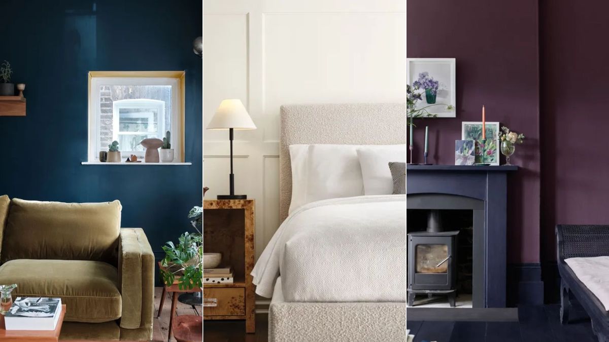
The winter months present the perfect opportunity to lean into color in our homes. While the weather outside may be drab, our homes can become cozy spaces to retreat to with the right color choices – whether bold or pared-back.
Luxurious colors are sought after year-long, giving our homes a refined edge. But during the winter, embracing these rich-looking colors is a great way to boost cozy appeal while establishing a timeless feel that’s fitting for the year ahead.
Here, we’ve rounded up six rich-looking colors that interior designers love using for winter decorating this year. From trend-topping burgundy to greens inspired by the natural world, these winter color trends are full of inspiration.
6 rich-looking colors designers love for winter decorating
While what makes a color ‘rich-looking’ is subjective, we’d say that deep, moody hues such as browns, purples, and dark reds naturally feel refined and elegant. That said, you can’t go wrong with lighter neutrals, which can make your home feel sophisticated regardless of the season.
Burgundy
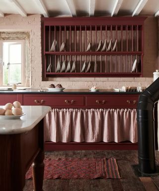
(Image credit: deVOL Kitchens)
Decorating with burgundy comes as no surprise as a rich-looking color admired by designers this winter. This rich hue has been quite literally everywhere this season, so if you’re looking for an equally trendy and sophisticated shade to bring into your home this winter, look no further.
‘The worlds of fashion and interior design are always closely aligned, and this year, burgundy (or oxblood) is making a bold statement in the winter 2024-2025 collections,’ says Boston-based interior designer Kristen Rivoli. ‘I adore burgundy as both a statement color and an accent in my interiors. It exudes elegance and adds a grounding presence to any room, whether as a chair, sofa, or throw cushion. There’s nothing more luxurious than burgundy walls, especially when it’s a leather wallcovering.’
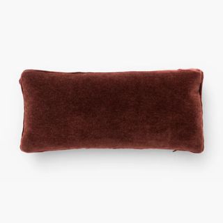
Mohair Pillow with Velvet Stripe
Bring this trending hue into your home with this velvet pillow – perfect for elevating a neutral sofa.
Another designer championing this rich color trend for the winter season is Bethany Adams, who adds: ‘I am leaning hard into burgundy this winter. It’s such an inherently cozy color and it’s remarkably easy to incorporate whether you go for a full-on color drenching or just a hit of color by way of a throw pillow. It oozes richness and sophistication, hints at holiday spirit, and hides all traces of festive camaraderie gone awry.’
Brown
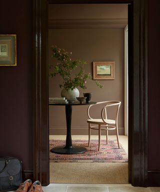
(Image credit: Little Greene)
If you prefer decorating with neutrals, then brown is a great way to go. Adding more depth and coziness to lighter schemes, dark brown tones feel every ounce sophisticated and moody – perfect for the winter months.
This is a favorite color trend for designer Grayson Knight of Dallas-based Layered Dimensions Interior Design, who says: ‘Deep, saturated hues of brown compliment beautifully to holiday greenery as well as warm white lights and decorations. Leaning into the earth tones and color hues creates a stunning organic feel while still balancing with various holiday elements that may already exist for a client.’
Feeling inspired to bring this cozy hue into your space? Take a look at the best brown paints, as recommended by interior designers.
Purple
(Image credit: Annie Sloan)
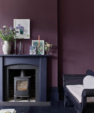
Decorating with purple is shaping up to be a major color trend for the year ahead, but it feels perfectly aligned with the winter season due to its rich feel. Below, paint and color expert Annie Sloan explains why this is her favorite shade for this time of year:
‘Deep purple is my number one pick for winter decorating. It’s such a full comforting color, and it’s been making appearances as a supporting shade the past few years. Now is the time for plum to take central shade! The natural association is with warmth and golden colors, like those we see during the prime plum season of late summer and early Autumn. It’s got a lot of positive connotations yet is more sophisticated than other typically “happy” colors such as corals and yellows.
‘A shade once reserved for kings and emperors, purple is a bold and intriguing choice for living rooms. A warm, dramatic, and rich jewel-toned aubergine with maroon and red elements, my Tyrian Plum Wall Paint is a homage to the ancient pigment, Tyrian purple (traditionally harvested from snails) – a dye so sought-after that its use was controlled by Ancient Greek legislation.
‘Regal yet mellow, Tyrian Plum’s warmth, ripeness, and depth of pigment pairs beautifully with other jewel tones like emerald green or navy blue and can be lifted depending on the season with cornflower blues, soft pinks, and whites for a flattering year-round look. This deeply saturated maroon will flatter north-facing spaces and will work especially well in intimate spaces like dining rooms or bedrooms.’
Another recommended purple paint is Benjamin Moore’s Amazon Soil, of which designer Elizabeth Bolognino says: ‘It is a warm and moody plum with the perfect ratio of burgundy and brown undertones. This paint sets a fabulous backdrop for holiday festivities and indoor coziness.’

Amazon Soil, Benjamin Moore
If you want to bring purple into your home without going too saturated, Amazon Soil makes a great choice with its muted look.
Green
(Image credit: Benjamin Moore)
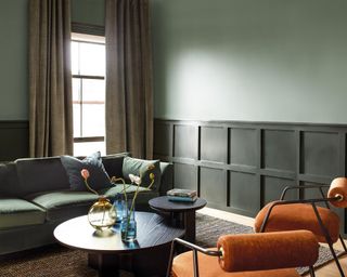
‘This winter, I’m loving deep, muted greens like olive or sage. They bring a grounding, natural quality to a space while feeling both festive and timeless. These greens pair beautifully with warm neutrals, vintage brass, or even touches of oxblood (also a tried and true favorite of mine), tying into the rich, earthy palettes trending for 2025. Incorporating these shades through throw pillows, blankets, or even painted cabinetry adds depth and coziness for the season,’ says designer Cheryl Clendenon, owner of In Detail Interiors.
Decorating with green, specifically deep shades, is also a favorite for Jessika Gatewood of Gatewood Designs, who adds that it works especially well as a sophisticated color during the holidays: ‘It’s a perfect match for the festive season, pairing seamlessly with natural materials like garland, wood accents, and even twinkle lights. For me, green captures the coziness of winter while still feeling fresh and sophisticated.’
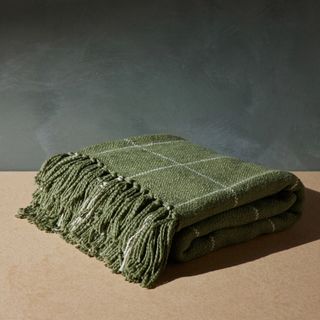
Claude Throw by Morrow Soft Goods
Add this green throw to a living room sofa to boost the cozy feel and tap into this natural color trend.
Neutrals
(Image credit: Sherwin-Williams)
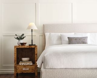
Neutrals are arguably some of the most enduring and timeless colors, giving your home an elegant look and feel. While darker colors take the lead at this time of year due to their cozy nature, there’s no reason not to embrace classic neutral rooms for a calming space amid the festivities.
‘Winter time is cold and often dreary but sometimes you get those warm rays of sunlight streaming in. So I love decorating with warmer tones of neutrals like creams, ivories, and in particular, I’m loving camel this year. A camel velvet or throw just warms up a wintery white space in an elegant, apres ski sort of way,’ says interior designer Rosanna Bassford of Memmo Interiors.
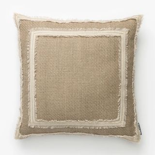
Keep things classic with this neutral pillow cover – a great way to elevate a neutral bedroom with its textured fabric.
Blue
(Image credit: Farrow & Ball)
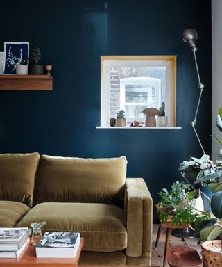
While warmer tones such as burgundy really come into their own during the winter months, decorating with blue can feel just as sophisticated. Deep and dark shades of blue can feel expensive and are a great way to add a luxurious feel to your home while maintaining longevity year-long.
Interior designer, Jonathan Savage of Savage Interior Design specifically favors a ‘dark peacock blue’ for the winter months, telling us: ‘It pops around the holidays and looks beautiful next to a Thanksgiving table or a Christmas tree and is a fun, happy color to celebrate New Years, while not being too overpowering.’
Although rich blues can feel more sophisticated, this color trend can be toned down if your style favors a more subtle look: ‘My favorite winter colors are what I call muddy colors, meaning they sometimes have a foot in two colors. For example, a muddy gray blue such as Farrow & Ball’s De Nimes,’ says designer Cathy Purple Cherry.

This blue paint isn’t at all lively, but instead calming and understated, making for a timeless paint color.
Above all else, the colors you decorate with this winter and beyond should be the ones you’re the most drawn to. Whether that’s soft neutrals or rich and moody shades, any color can work well in your home if it brings you joy.
link

:max_bytes(150000):strip_icc()/GettyImages-1220602415-869d569919b24829b21868f530a8207f.jpg)

